|
Basic Design Guidelines
Desktop publishing can seem like a daunting task. However, you don't
have to be an artist to create effective marketing materials -- you just
have to know a few basics. The following is adapted from Robin Williams'
book, The Non-Designer's Design Book.
Simplify the process with these design guidelines:
- Contrast
What is it?
Contrast occurs when elements within your materials are varied in
order to attract attention, highlight key areas, and make your
materials more visually interesting.
How?
You can add contrast to your materials by varying size, color, font,
spacing, etc. For example, use a "drop cap," making the first letter
of a section very large in contrast to the rest of the text. Using
elements that are big and small, or light and dark, is also an
effective technique.
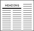
 |
Drop Cap |
 |
The heading font is bigger
than the font in the text.
A bold line separates the
heading from text.small VS. BIG |
Example from the Field
Community Teamwork, Inc., contrasts large white type against a black
background to highlight their Foster Grandparent Program. Click to
see this
example.
- Repetition
What is it?
Repetition occurs when an element is repeated to give a sense of
unity.
How?
You might repeat a specific logo or color throughout your document.
You might use repetition in the form of a motif that is carried
throughout your materials.
 |
The logo is repeated
throughout the document. |
Example from the Field
Repeated use of star shapes in Dane County's flyer for its annual
recognition ceremony emphasizes the event's aim to honor RSVP's
"stars" and serves as a tasteful frame for the flyer text. Click to
see this
example.
- Alignment
What is it?
Alignment occurs when a consistent layout is used to provide order
and increase readability. Align text consistently, either right,
left, or centered.
How?
You can use a grid layout with consistent margins to organize
columns of text. This makes newsletters, brochures, and newspapers
more readable.
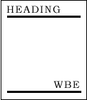
 |
Three-column
layout design. |
 |
All text is
right aligned. |
Example from the Field
By following a simple three-column layout framed with clean external
margins, the front page of this newsletter could contain three
stories and logo art without seeming cluttered. Click to see this
example.
- Proximity
What is it?
Proximity occurs when similar items are grouped or placed together
in order to visually emphasize their commonality.
How?
Rather than scattering several small photos, you can put them
together to draw attention and create impact.
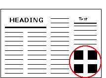 |
Pictures of the same size
are grouped together. |
Example from the Field
A flyer advertising a cookbook to benefit Community Services, Inc.'s
FGP, SCP and RSVP programs groups related text items together,
allowing the viewer to quickly absorb important information about
the fundraiser. Click to see this
example.
- Simplicity
What is it?
Always try to keep it simple. For example, using too many different
kinds of design elements can cause confusion and decrease
readability.
How?
Don't mix too many different fonts, colors, or styles on your pages.
Keep the alignment consistent, group similar items together, and
give the page a sense of unity. The image on the left below is "too
much of a good thing"! Keep in mind that less is more.
 |
Too many design elements are disorienting. |
 |
Simplicity gives a clean, readable look and feel. |
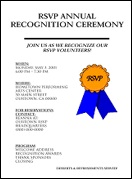
Example from the Field
A flyer advertising an RSVP annual recognition ceremony is a good
example of simplicity. The flyer has been edited down to the
essential information, which is lined up on the left side of the
page. Click to see this
example.
"Before and After" Examples
Here are a few "before and after" examples. Click on the "after" link to
see an example of a flyer created with the five basic design guidelines
in mind. Notice how the design guidelines were used to dramatically
improve the materials.
Bringing It All TogetherThe following flyer makes use of effective design
guidelines such as contrast, repetition, alignment, proximity, and
simplicity.
 |